If I were asked to say what is at once the most important production of Art and the thing most to be longed for, I should answer, A Beautiful House; and the thing to be longed for, I should answer, A beautiful Book.
Last week I wrote about this William Morris quote in relation to A Beautiful House. The comments and discussion developed into one which talked about home being a place hospitable to others and hospitable to art itself and its creation, especially for children. This post, then, is going to be a beginning towards thinking about the second part of the quote, about beautiful books.
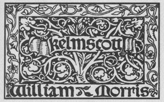
Morris sug gests that we should long for beautiful books. And as founder of Kelmscott Press, Morris (1834-1896) led the revival of fine typography that can said to have begun the Private Press movement. For a list of books Kelmscott produced including access to online editions (with page-turning technology) click here. It was hard to find images that do these editions justice. Feeling the pages and the raised and embossed ink crafted into such detailed illuminations and typography is an experience difficult to describe (especially without recourse to appropriate images).
But the time of Kelmscott is long passed and the evolution of technology in relation to the production (and even reading) of books has been swift. In increasing access to printed material by the largest numbers of people, it became imperative to decrease costs as much as possible and automation assisted in this endeavour. In turn, the decrease in craftsman and artists able to produce the kind of work that was staple to Kelmscott was further exacerbated by the passing of generations.
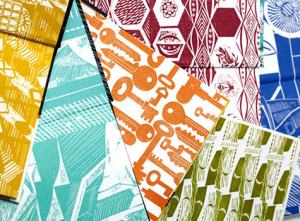
This year, both Faber and Penguin have released and re-released editions from their collections adorned with special covers. The covers are printed in the normal way, but they are adorned with a commissioned artistic designs.
Faber, above top and right, have produced a series of editions of poetry by Simon Armitage, Wendy Cope, Phillip Larkin, Alice Oswald, Don Paterson, and Sylvia Plath with covers and endpapers by a range of artists including Peter Clayton, Ed Kluz, Michael Kirkman, Jonathon Gibbs, Charles Shearer, and Sarah Young. The typography of the texts are not different.
Earlier this year Penguin released a series of books in their Penguin Classics editions with special limited edition covers by artist Coralie Bickford-Smith. They are cloth-bound and they are specifically being marketed as “collectibles.”
Bickford-Smith describes the process for creating the covers:
“All the books in this series have patterns that adhere to a strict grid…we set up mood boards of visual ideas – textures, ornaments, objects, colours, all inspired by themes from the stories or by the period, or just the novel’s atmosphere…”

But is this mere window-dressing?
Why have we disconnected the beauty of the printed book from its content?
Can it just be ascribed to commercial pressures? Is there are a contingent limit on cost and accessibility if we want beautifully printed and made books? Is this mutually exclusive to the rise of mass print culture and the overriding profit imperative?
These are big questions and I’ve answered none of them. As a final point, I do want to note that there are some poets, including well-established poets and authors for whom the printed book and the content are not disconnected. Seamus Heaney, for example has published some beautiful limited editions of some of his recent collections of poetry which have been numbered and which are objects of art.


Thanks for commenting about my Harry Potter Penguin books, good read here.
I for one haven’t the foggiest on why covers and print has changed they way it has over the years. I long for more books to be cloth bound and printed in the quailty like the Penguin classics you’ve listed.
My best guess is that it all boils down to money in some manner. Cost of book, printing, and perhaps publishers would rather send out thousands of cheaply made books, than a lesser amount of well polished books. Because if no one busy the cheap ones, at least they were cheap. And they take a loss if no one busy the heavy duty collector’s type books.
Loved your post. I am still in the Morris mood I was left in after having read A.S. Byatt’s most recent novel, “Children’s Book” and I was so happy to see some example of Morris’ own creations.
I love the book, the smell of paper, the feeling of holding it in my hand, the esthetic pleasure of looking at a well designed cover. Books are still beautiful!